
So what do you think? Does it suck or does it work?
I kinda stopped animating. I could probably voice act some stuff though.
Age 37, Male
Traffic Guy
UNCC
Charlotte, NC
Joined on 3/20/07
- Level:
- 17
- Exp Points:
- 2,980 / 3,210
- Exp Rank:
- 18,705
- Vote Power:
- 5.89 votes
- Rank:
- Police Lieutenant
- Global Rank:
- 5,628
- Blams:
- 758
- Saves:
- 846
- B/P Bonus:
- 14%
- Whistle:
- Normal
- Trophies:
- 3
- Medals:
- 794
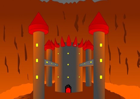
A Background I Drew. Thoughts?
Comments
Uhm, when did you EVER visit my castle?
How'd you get past Teh 13 Warriors of VulUntehlor.
do what now?
Yeah, put a bit more detailing in the castle, rock and magma(bricks, bubbles, ect.) Also lay off the gradients a bit, it hurts the eyes...
really? i thought the gradients looked all right on the towers and back walls at least.
Is it for a flash? It's ok. The landscape needs a little more detail, maybe some shadows on the ground cast by the castle. Also the windows look two-dimensional, add the thickness of the wall and the curvature of the towers. I don't really like the cone roofs on the towers. But if you're going to keep them, add shading as the rest of the towers. That's all. overall it's nice, definitely doesn't suck, and it really has atmosphere.
it is indeed for a flash. and does the castle (or citadel, i think that's a cooler word) need shadows? i figured the only real light came from the surrounding lava, so there wouldn't really be any shadows on the ground, just on the towers and stuff.
i think you should tone down on the gradients a bit. make the glow on the castle a bit less orange - more a mix of gray and orange. giving it some stony texture would make it look great. just add a few stone bricks here and there, and cluster a few up. it gives a great illusion. i did the same when i played a brick wall in a Shakespeare play a few years ago (lulz, don't ask :P )
i did add some gray, but maybe it needs a little more... and i agree that some texture would do it some good.
and man, you just blew my mind. why did they need you to PLAY a brick wall? did they have no set pieces or anything?
Mere gradiants isn't quite enough to say its "detailed". For a lava castle like this, I suggest more (as others have already stated, rocks, debris, bricks on the castle) The door is quite detailed so maybe use that as a sorta base design if you want. but hey, I'm not an artist =P
I do agree the gradiants WORK though since you set them it at an angle. The cave walls are good enough, dunno how else to further expand there. Lastly, the sky needs to be a little bigger or lower so we can see that its NOT a cave =P (that is the sky right?)
ha, yeah it's the sky. there is a lot more sky up there with sort of a dark cloudy overcast, it's just cut off right now. it'll be more apparent in the actual flash.
give the lava a glow awell as the refletion on the walls
i tried to soften fill edges or whatever but it looked... retarded.
Looks like something Legendary Frog would draw. :(
ouch. i'll definitely try to work on it then.
Needs
Bricks on the castle
More detailed bubbly magma
More sense of shading and reflection
A lot more detail on the wall in the back
and that's about it. Otherwise it looks okay.
sounds good. i'll do that.
do some hard shades for the magma instead of those cheesy gradients ;)
add the odd bricks, cracks, rocks etc scattered around maybe?
yeah a few knickknacks around would do some good.
looking forward to the next rocket crotch, by the way.
it needs more detail maybe little objects in the windows possibly and make the magma look more like magma maybe bubbles or somthing n give the castle bricks if you know what i mean
It doesn't really look too detailed, but better than what I can do! :]
...Is that a burger on the inner right spike?
Not bad... I don't like the cone tips or the lack of shadows. It looks like it's open topped, so there will still be shading on the ground. I don'y mind the gradients, but please for the love of atheism fix the magma.
ah ha.. nah i believe that's just the registration point of the symbol. i didn't even notice that was there...
and yes, i'll fix the magma.
Needs a better color scheme, and more depth. Darker outlines, or use the brush tool.
Overall, needs to be MUCH better for it to work.
but i like the outlines like that. and pencil > brush.
i think the play was A Midsummer Night's Dream, where there is a play within a play. i played an actor who played a wall within the play. i don't care too much for Shakespeare, but he's pretty witty at times (:
Its pretty good dude, you might want to add a little to the lava. For an example add a little patch of black or bright red (black being obsidian and bright red or white being very hot lava)
i think its good but yes it does have to be more detailed
i like it.very creative.
I like the style - but again, like people said, the magma and the bricks and windows need work.
Also, you forgot a path going up to the castle, and I'd lower the height of the cave, show a bit more sky, and include an overhang.
It works really well
PolishMatt
Too simplistic. Add depth into your windows and the whole castle and cave in general. The magma looks like hot cheese, sorry, make it more redish and bubbly. And try to make it a bit more complicated. Yeah, it should be fine after.
BMack24 (Updated )
hm it does kinda look like cheese. at least you could tell it was magma though. maybe i'll look at... pictures of magma or something.